HTML5
定位geolocation
PC端,主要是获取IP地址进行定位,精度非常差- 移动端,主要通过
GPS定位,精度很高
geolocation
- getCurrentPosition 获取位置(1次)
- 坐标信息
res.coords
- 坐标信息
- watchPosition 不断获取位置
- clearWatch
定位.html
<!DOCTYPE html>
<html>
  <head>
    <meta charset="utf-8">
    <title></title>
    <style media="screen">
    .bmap {width:600px; height:400px; border:1px solid black}
    </style>
    <script type="text/javascript" src="http://api.map.baidu.com/api?v=1.2"></script>
    <script>
    window.onload=function (){
      var oBtn=document.getElementById('btn1');

      oBtn.onclick=function (){
        //getCurrentPosition(成功, 失败, 参数)
        navigator.geolocation.getCurrentPosition(function (res){

          console.log(res.coords);
          alert('成功');

          //创建和初始化地图函数:
          function initMap(){
            createMap();//创建地图
            setMapEvent();//设置地图事件
            addMapControl();//向地图添加控件
            addMapOverlay();//向地图添加覆盖物
          }
          function createMap(){
            map = new BMap.Map("bmap");
            map.centerAndZoom(new BMap.Point(res.coords.longitude,res.coords.latitude),15);
          }
          function setMapEvent(){
            map.enableScrollWheelZoom();
            map.enableKeyboard();
            map.enableDragging();
            map.enableDoubleClickZoom()
          }
          function addClickHandler(target,window){
            target.addEventListener("click",function(){
              target.openInfoWindow(window);
            });
          }
          function addMapOverlay(){
            var markers = [
              {content:"来找我啊",title:"我的位置",imageOffset: {width:0,height:3},position:{lat:res.coords.latitude,lng:res.coords.longitude}}
            ];
            for(var index = 0; index < markers.length; index++ ){
              var point = new BMap.Point(markers[index].position.lng,markers[index].position.lat);
              var marker = new BMap.Marker(point,{icon:new BMap.Icon("http://api.map.baidu.com/lbsapi/createmap/images/icon.png",new BMap.Size(20,25),{
                imageOffset: new BMap.Size(markers[index].imageOffset.width,markers[index].imageOffset.height)
              })});
              var label = new BMap.Label(markers[index].title,{offset: new BMap.Size(25,5)});
              var opts = {
                width: 200,
                title: markers[index].title,
                enableMessage: false
              };
              var infoWindow = new BMap.InfoWindow(markers[index].content,opts);
              marker.setLabel(label);
              addClickHandler(marker,infoWindow);
              map.addOverlay(marker);
            };
          }
          //向地图添加控件
          function addMapControl(){
            var scaleControl = new BMap.ScaleControl({anchor:BMAP_ANCHOR_BOTTOM_LEFT});
            scaleControl.setUnit(BMAP_UNIT_IMPERIAL);
            map.addControl(scaleControl);
            var navControl = new BMap.NavigationControl({anchor:BMAP_ANCHOR_TOP_LEFT,type:BMAP_NAVIGATION_CONTROL_LARGE});
            map.addControl(navControl);
            var overviewControl = new BMap.OverviewMapControl({anchor:BMAP_ANCHOR_BOTTOM_RIGHT,isOpen:true});
            map.addControl(overviewControl);
          }
          var map;
            initMap();
        }, function (err){
          alert('失败');
        });
      };
    };
    </script>
  </head>
  <body>
    <input type="button" value="定位" id="btn1">
    <div class="bmap" id="bmap">

    </div>
  </body>
</html>
百度地图生成器
- 创建地图-百度地图生成器
- 定位中心点
- 设置地图
- 添加标注
- 获取代码
src="http://api.map.baidu.com/api?v=1.2"版本用1.2,不然需要申请密钥,麻烦
bmap.html
<!DOCTYPE html>
<html xmlns="http://www.w3.org/1999/xhtml">
  <head>
    <meta http-equiv="Content-Type" content="text/html; charset=utf-8" />
    <meta name="keywords" content="百度地图,百度地图API,百度地图自定义工具,百度地图所见即所得工具" />
    <meta name="description" content="百度地图API自定义地图,帮助用户在可视化操作下生成百度地图" />
    <title>百度地图API自定义地图</title>
    <!--引用百度地图API-->
    <script type="text/javascript" src="http://api.map.baidu.com/api?v=1.2"></script>
  </head>

  <body>
    <!--百度地图容器-->
    <div style="width:700px;height:550px;border:#ccc solid 1px;font-size:12px" id="map"></div>
    <p style="color:red;font-weight:600">地图生成工具基于百度地图JS api v2.0版本开发,使用请申请密匙。
      <a href="http://developer.baidu.com/map/index.php?title=jspopular/guide/introduction" style="color:#2f83c7" target="_blank">了解如何申请密匙</a>
      <a href="http://lbsyun.baidu.com/apiconsole/key?application=key" style="color:#2f83c7" target="_blank">申请密匙</a>
    </p>
  </body>
  <script type="text/javascript">
    //创建和初始化地图函数:
    function initMap(){
      createMap();//创建地图
      setMapEvent();//设置地图事件
      addMapControl();//向地图添加控件
      addMapOverlay();//向地图添加覆盖物
    }
    function createMap(){
      map = new BMap.Map("map");
      map.centerAndZoom(new BMap.Point(116.403963,39.917167),15);
    }
    function setMapEvent(){
      map.enableScrollWheelZoom();
      map.enableKeyboard();
      map.enableDragging();
      map.enableDoubleClickZoom()
    }
    function addClickHandler(target,window){
      target.addEventListener("click",function(){
        target.openInfoWindow(window);
      });
    }
    function addMapOverlay(){
      var markers = [
        {content:"来找我啊",title:"我的位置",imageOffset: {width:0,height:3},position:{lat:39.914898,lng:116.404035}}
      ];
      for(var index = 0; index < markers.length; index++ ){
        var point = new BMap.Point(markers[index].position.lng,markers[index].position.lat);
        var marker = new BMap.Marker(point,{icon:new BMap.Icon("http://api.map.baidu.com/lbsapi/createmap/images/icon.png",new BMap.Size(20,25),{
          imageOffset: new BMap.Size(markers[index].imageOffset.width,markers[index].imageOffset.height)
        })});
        var label = new BMap.Label(markers[index].title,{offset: new BMap.Size(25,5)});
        var opts = {
          width: 200,
          title: markers[index].title,
          enableMessage: false
        };
        var infoWindow = new BMap.InfoWindow(markers[index].content,opts);
        marker.setLabel(label);
        addClickHandler(marker,infoWindow);
        map.addOverlay(marker);
      };
    }
    //向地图添加控件
    function addMapControl(){
      var scaleControl = new BMap.ScaleControl({anchor:BMAP_ANCHOR_BOTTOM_LEFT});
      scaleControl.setUnit(BMAP_UNIT_IMPERIAL);
      map.addControl(scaleControl);
      var navControl = new BMap.NavigationControl({anchor:BMAP_ANCHOR_TOP_LEFT,type:BMAP_NAVIGATION_CONTROL_LARGE});
      map.addControl(navControl);
      var overviewControl = new BMap.OverviewMapControl({anchor:BMAP_ANCHOR_BOTTOM_RIGHT,isOpen:true});
      map.addControl(overviewControl);
    }
    var map;
      initMap();
  </script>
</html>
localStorage
cookie
- 存储内容比较小,只有4K
- 浏览器和服务器共享
localStorage
- 存储内容比较大,有5M
- 永久存储
- 浏览器独享,存在跨域问题
- 主要用途:记录用户名、保存草稿
sessionStorage
- 会话期间存储,浏览器一关就没了
存和取
localStorage.html
<!DOCTYPE html>
<html>
  <head>
    <meta charset="utf-8">
    <title></title>
    <script>
    //localStorage.a=12;        //存
    //alert(localStorage.a);    //取

    console.log(localStorage);

    //localStorage.b=5;
    //localStorage.c=99;
    //遍历
    /*for(let name in localStorage){
      alert(`${name}: ${localStorage[name]}`);
    }*/

    for(let i=0;i<localStorage.length;i++){
      let key=localStorage.key(i);

      alert(`${key}: ${localStorage[key]}`);
    }
    </script>
  </head>
  <body>

  </body>
</html>
删除
localStorage2.html
<!DOCTYPE html>
<html>
  <head>
    <meta charset="utf-8">
    <title></title>
    <script>
    delete localStorage.a;
    </script>
  </head>
  <body>

  </body>
</html>
WebWorker
- 多进程,更充分发挥计算机资源(内存×、IO×、网络×、CPU√),这里指
CPU - 主进程也称为UI进程
- 子进程也称为工作进程,子进程不能再创建子进程
- 不能控制
UI的东西,但是可以进行数据交互 - 也存在跨域问题
实现
- 发送数据
oW.postMessage({n1: 25, n2: 99}) - 接收数据
oW.onmessage=function
1.js
this.onmessage=function (ev){
  let {n1, n2}=ev.data;

  let result=n1+n2;

  this.postMessage(result);
};
webworker.html
<!DOCTYPE html>
<html>
  <head>
    <meta charset="utf-8">
    <title></title>
    <script>
    let oW=new Worker('1.js');

    oW.onmessage=function (ev){
      alert(ev.data);
    };

    oW.postMessage({n1: 25, n2: 99});
    </script>
  </head>
  <body>

  </body>
</html>
webworker2.html
<!DOCTYPE html>
<html>
  <head>
    <meta charset="utf-8">
    <title></title>
    <script>
    let oW=new Worker('1.js');

    oW.onmessage=function (ev){
      alert(ev.data);
    };

    oW.postMessage(document);
    </script>
  </head>
  <body>

  </body>
</html>
canvas
canvas
- 位图,放大会失真
HTML5标准
SVG
- 矢量图,可以无限缩放
- 不是
HTML5的东西,是一个独立标准
VML
- 矢量图,可以无限缩放
IE的矢量图,搭配SVG可以解决所有浏览器兼容
实现
- 路径操作,相当于
PS的选区操作,没有效果,还需后续操作,需要闭合,一定要用closePath - 边线
stroke() - 填充
fill()
版本一
canvas.html
<!DOCTYPE html>
<html>
  <head>
    <meta charset="utf-8">
    <title></title>
    <style media="screen">
    body {background: black; text-align:center;}
    #c1 {background:#fff;}
    </style>
    <script>
    window.onload=function (){
      let oC=document.getElementById('c1');

      //图形上下文——接口:所有绘图方法、属性
      let gd=oC.getContext('2d');

      //路径操作——类似PS的选区

      //起点
      gd.moveTo(470, 81);
      gd.lineTo(778, 236);
      gd.lineTo(532, 411);
      gd.lineTo(312, 259);
      gd.lineTo(470, 81);     //?

      gd.stroke();
      //gd.fill();
    };
    </script>
  </head>
  <body>
    <canvas id="c1" width="800" height="600"></canvas>
  </body>
</html>
版本二
- 手动闭合
gd.lineTo(470, 81),如果有线宽lineWidth的话,会导致闭合不完整,推荐使用自带的闭合方法closePath
canvas2.html
<!DOCTYPE html>
<html>
  <head>
    <meta charset="utf-8">
    <title></title>
    <style media="screen">
    body {background: black; text-align:center;}
    #c1 {background:#fff;}
    </style>
    <script>
    window.onload=function (){
      let oC=document.getElementById('c1');

      //图形上下文——接口:所有绘图方法、属性
      let gd=oC.getContext('2d');

      //路径操作——类似PS的选区

      //起点
      gd.moveTo(470, 81);
      gd.lineTo(778, 236);
      gd.lineTo(532, 411);
      gd.lineTo(312, 259);
      //gd.lineTo(470, 81);     //?
      gd.closePath();

      gd.lineWidth=20;
      gd.stroke();
      //gd.fill();
    };
    </script>
  </head>
  <body>
    <canvas id="c1" width="800" height="600"></canvas>
  </body>
</html>
版本三
- 线宽:lineWidth
- 线色:strokeStyle
- 填充颜色:fillStyle
canvas3.html
<!DOCTYPE html>
<html>
  <head>
    <meta charset="utf-8">
    <title></title>
    <style media="screen">
    body {background: black; text-align:center;}
    #c1 {background:#fff;}
    </style>
    <script>
    window.onload=function (){
      let oC=document.getElementById('c1');

      //图形上下文——接口:所有绘图方法、属性
      let gd=oC.getContext('2d');

      //路径操作——类似PS的选区

      //起点
      gd.moveTo(470, 81);
      gd.lineTo(778, 236);
      gd.lineTo(532, 411);
      gd.lineTo(312, 259);
      //gd.lineTo(470, 81);     //?
      gd.closePath();

      //gd.lineWidth=20;
      //gd.strokeStyle='green';
      //gd.stroke();

      gd.fillStyle='yellow';
      gd.fill();
    };
    </script>
  </head>
  <body>
    <canvas id="c1" width="800" height="600"></canvas>
  </body>
</html>
CSS3基础
圆角
- CSS3圆角只需设置一个属性
border-radius(含义是”边框半径”)
版本一
border-radius属性提供一个值,就能同时设置四个圆角的半径- 圆角的”水平半径”(
horizontal radius)和”垂直半径”(vertical radius)都设置为10px
圆角.html
<!DOCTYPE html>
<html>
  <head>
    <meta charset="utf-8">
    <title></title>
    <style media="screen">
    .box {width:300px; height:300px; background:#CCC; margin:10px auto 0; border-radius:10px;}
    </style>
  </head>
  <body>
    <div class="box">

    </div>
  </body>
</html>
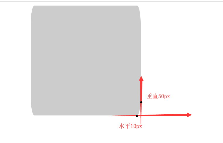
版本二
- 4个角的水平半径是
10px,垂直半径是50px
圆角2.html
<!DOCTYPE html>
<html>
  <head>
    <meta charset="utf-8">
    <title></title>
    <style media="screen">
    .box {width:300px; height:300px; background:#CCC; margin:10px auto 0; border-radius:10px/50px;}
    </style>
  </head>
  <body>
    <div class="box">

    </div>
  </body>
</html>
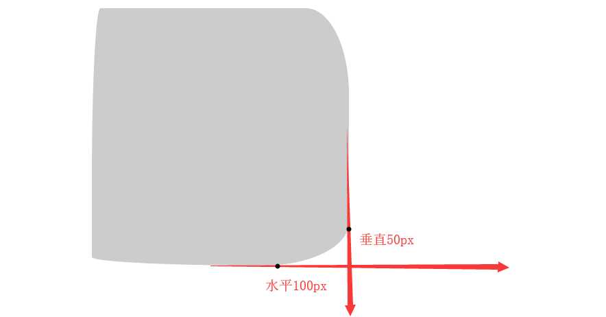
版本三
- 用斜杠区分,第一组值表示水平半径,第二组值表示垂直半径
圆角3.html
<!DOCTYPE html>
<html>
  <head>
    <meta charset="utf-8">
    <title></title>
    <style media="screen">
    .box {width:300px; height:300px; background:#CCC; margin:10px auto 0; border-radius:10px 50px 100px 200px/200px 100px 50px 10px;}
    </style>
  </head>
  <body>
    <div class="box">

    </div>
  </body>
</html>
border-radius: 1em/5em;

/* 等价于: */

border-top-left-radius:     1em 5em;
border-top-right-radius:    1em 5em;
border-bottom-right-radius: 1em 5em;
border-bottom-left-radius:  1em 5em;

border-radius: 4px 3px 6px / 2px 4px;

/* 等价于: */

border-top-left-radius:     4px 2px;
border-top-right-radius:    3px 4px;
border-bottom-right-radius: 6px 2px;
border-bottom-left-radius:  3px 4px;
版本四
- 4个角,水平半径是宽度的50%和垂直半径是高度的50%
圆角4.html
<!DOCTYPE html>
<html>
  <head>
    <meta charset="utf-8">
    <title></title>
    <style media="screen">
    .box {width:300px; height:300px; background:#CCC; margin:10px auto 0; border-radius:50%;}
    </style>
  </head>
  <body>
    <div class="box">

    </div>
  </body>
</html>
阴影
- 文字阴影
text-shadow - 盒模型阴影
box-shadow
版本一
- 文字阴影,
text-shadow:5px 50px 1px red,水平5px,垂直50px,阴影程度1px,阴影颜色红色
阴影.html
<!DOCTYPE html>
<html>
  <head>
    <meta charset="utf-8">
    <title></title>
    <style media="screen">
    .box {width:300px; height:300px; background:#CCC; margin:10px auto 0; text-shadow:5px 50px 1px red}
    </style>
  </head>
  <body>
    <div class="box">
      这是一些字
    </div>
  </body>
</html>
版本二
- 阴影类型
inset投影为内阴影,可选 - X轴偏移量
5px - Y轴偏移量
50px - 阴影模糊半径
5px - 阴影扩展半径,可选
- 阴影颜色红色
阴影2.html
<!DOCTYPE html>
<html>
  <head>
    <meta charset="utf-8">
    <title></title>
    <style media="screen">
    .box {width:300px; height:300px; background:#CCC; margin:10px auto 0; box-shadow:inset 5px 50px 5px red}
    </style>
  </head>
  <body>
    <div class="box">
      这是一些字
    </div>
  </body>
</html>
版本三
阴影3.html
<!DOCTYPE html>
<html>
  <head>
    <meta charset="utf-8">
    <title></title>
    <style media="screen">
    .box {width:300px; height:300px; background:#CCC; margin:10px auto 0; box-shadow:2px 2px 2px black}
    .box:active {box-shadow:inset 2px 2px 2px black}
    </style>
  </head>
  <body>
    <div class="box">
      这是一些字
    </div>
  </body>
</html>
版本四
box-shadow:2px 2px 20px 50px black,分别代表水平偏移2px,垂直偏移2px,阴影模糊度20px,阴影扩展半径50px,阴影颜色黑色
阴影4.html
<!DOCTYPE html>
<html>
  <head>
    <meta charset="utf-8">
    <title></title>
    <style media="screen">
    .box {width:300px; height:300px; background:#CCC; margin:10px auto 0; box-shadow:2px 2px 20px 50px black}
    </style>
  </head>
  <body>
    <div class="box">
      这是一些字
    </div>
  </body>
</html>
渐变
- 类型
- 线性渐变
Linear Gradients - 径向渐变
Radial Gradients - 圆锥渐变
conic-gradient
- 线性渐变
- 渐变属于背景图片中的一种
版本一
- 要创建最基本的渐变类型,只需指定两种颜色即可。 这些被称为色标。 至少指定两个色标,
渐变.html
<!DOCTYPE html>
<html>
  <head>
    <meta charset="utf-8">
    <title></title>
    <style media="screen">
    .box {
      width:300px; height:300px; background:#CCC; margin:10px auto 0;
      background-image:-webkit-linear-gradient(red, green);
    }
    </style>
  </head>
  <body>
    <div class="box"></div>
  </body>
</html>
版本二
- 使用多种颜色渐变,默认情况下,所设置颜色会均匀分布在渐变路径中
渐变2.html
<!DOCTYPE html>
<html>
  <head>
    <meta charset="utf-8">
    <title></title>
    <style media="screen">
    .box {
      width:300px; height:300px; background:#CCC; margin:10px auto 0;
      background-image:-webkit-linear-gradient(red, green, yellow, black, blue, green);
    }
    </style>
  </head>
  <body>
    <div class="box"></div>
  </body>
</html>
版本三
-webkit-linear-gradient(red 50%, green 50%)红色占50%,绿色占50%,即没有渐变效果
渐变3.html
<!DOCTYPE html>
<html>
  <head>
    <meta charset="utf-8">
    <title></title>
    <style media="screen">
    .box {
      width:300px; height:300px; background:#CCC; margin:10px auto 0;
      background-image:-webkit-linear-gradient(red 50%, green 50%);
    }
    </style>
  </head>
  <body>
    <div class="box"></div>
  </body>
</html>

版本四
径向渐变
一个中心点向外围进行颜色渐变
-webkit-radial-gradient(left top, 100px 100px, red 30%, green 30%)渐变中心点在left top
4.html
<!DOCTYPE html>
<html>
  <head>
    <meta charset="utf-8">
    <title></title>
    <style media="screen">
    .box {
      width:300px; height:300px; background:#CCC; margin:10px auto 0;
      background-image:-webkit-radial-gradient(left top, 100px 100px, red 30%, green 30%);
    }
    </style>
  </head>
  <body>
    <div class="box"></div>
  </body>
</html>
rgba
rgba色彩模式与RGB相同,只是在GB模式上新增了Alpha透明度- R:红色值。正整数
0 - 255| 百分数0.0% - 100.0% - G:绿色值
- B:蓝色值
- A:
Alpha透明度,取值0~1之间。
rgba.html
<!DOCTYPE html>
<html>
  <head>
    <meta charset="utf-8">
    <title></title>
    <style media="screen">
    body {background:#F0F}
    .box {
      width:300px; height:300px; background:rgba(0,0,0,0.1); margin:10px auto 0;
      color:white;
    }
    </style>
  </head>
  <body>
    <div class="box">
      放一些文字
    </div>
  </body>
</html>
transform
- transform一定要加初始值
- 类型
- translate 平移
- rotate 旋转
- scale 缩放
- skew 倾斜
版本一
- 点击时,顺时针旋转90度
transform-rotate.html
<!DOCTYPE html>
<html>
  <head>
    <meta charset="utf-8">
    <title></title>
    <style media="screen">
    .box {
      width:300px; height:300px; background:#CCC; margin:100px auto 0;
      transition:1s all ease;
      transform:rotate(0deg);
    }
    .box:active{transform:rotate(90deg);}
    </style>
  </head>
  <body>
    <div class="box">
      放一些文字
    </div>
  </body>
</html>
版本二
- 点击时,元素在 X轴上拉伸2倍,在 Y轴上拉伸2部
transform-scale.html
<!DOCTYPE html>
<html>
  <head>
    <meta charset="utf-8">
    <title></title>
    <style media="screen">
    .box {
      width:300px; height:300px; background:#CCC; margin:100px auto 0;
      transition:1s all ease;
      transform:scale(1,1);
    }
    .box:active{transform:scale(2,2);}
    </style>
  </head>
  <body>
    <div class="box">
      放一些文字
    </div>
  </body>
</html>
版本三
transform-scale2.html
<!DOCTYPE html>
<html>
  <head>
    <meta charset="utf-8">
    <title></title>
    <style media="screen">
    .box {
      width:300px; height:300px; background:#CCC; margin:100px auto 0;
      transition:1s all ease;
      transform:scale(1,1);
    }
    .box:active{transform:scale(1,-1);}
    </style>
  </head>
  <body>
    <div class="box">
      放一些文字
    </div>
  </body>
</html>
版本四
transform-scale3.html
<!DOCTYPE html>
<html>
  <head>
    <meta charset="utf-8">
    <title></title>
    <style media="screen">
    .box {
      width:300px; height:300px; background:#CCC; margin:100px auto 0;
      transition:1s all ease;
      transform:scale(1,1);
    }
    .box:active{transform:scale(1,0);}
    </style>
  </head>
  <body>
    <div class="box">
      放一些文字
    </div>
  </body>
</html>
版本五
- 设置 X轴和 Y轴的倾斜角度
transform-skew.html
<!DOCTYPE html>
<html>
  <head>
    <meta charset="utf-8">
    <title></title>
    <style media="screen">
    .box {
      width:300px; height:300px; background:#CCC; margin:100px auto 0;
      transition:1s all ease;
      transform:skew(0,0);
    }
    .box:active{transform:skew(0,30deg);}
    </style>
  </head>
  <body>
    <div class="box">
      放一些文字
    </div>
  </body>
</html>
版本六
- 元素沿着 X轴正方向平移
100px,沿着 Y轴正方向平移200px
transform-translate.html
<!DOCTYPE html>
<html>
  <head>
    <meta charset="utf-8">
    <title></title>
    <style media="screen">
    .box {
      width:300px; height:300px; background:#CCC; margin:100px auto 0;
      transition:1s all ease;
      transform:translate(0,0);
    }
    .box:active{transform:translate(100px,200px);}
    </style>
  </head>
  <body>
    <div class="box">
      放一些文字
    </div>
  </body>
</html>
版本七
- CSS3的样式不改变盒模型
- 盒模型,物体占据的空间
- CSS3样式(尤其是translate)不会引起重排、重绘,性能更高
- DOM操作——越大越慢
- 重排
- 重绘
不改变盒模型.html
<!DOCTYPE html>
<html>
  <head>
    <meta charset="utf-8">
    <title></title>
    <style media="screen">
    * {margin:0; padding:0; list-style:none}
    #ul1 li {float:left; width:200px; height:200px; background:#CCC; margin:10px; transition:1s all ease; transform:scale(1); border:1px solid black; box-shadow:0 0 5px 40px black;}
    #ul1 li:active {transform:scale(2)}
    </style>
  </head>
  <body>
    <ul id="ul1">
      <li></li>
      <li></li>
      <li></li>
      <li></li>
      <li></li>
      <li></li>
      <li></li>
    </ul>
  </body>
</html>
transform高级
版本一
- 可以多个变换一起用,
{transform:scale(2,1) rotate(45deg)}先旋转45度,再横向拉伸2倍,顺序是”反的”,看似是反的,其实是正的:矩阵乘法
多个变换一起用.html
<!DOCTYPE html>
<html>
  <head>
    <meta charset="utf-8">
    <title></title>
    <style media="screen">
    .box {
      width:200px; height:200px; background:#CCC; margin:100px auto 0;
    }
    .box:active {transform:scale(2,1) rotate(45deg)}
    </style>
  </head>
  <body>
    <div class="box">aaa</div>
  </body>
</html>
版本二
- 2d
- rotate
- translate
- 3d
- rotateX/rotateY/rotateZ
- translateX/translateY/translateZ
- 景深/透视
perspective,数值越小代表3d效果越明显
3d变换.html
<!DOCTYPE html>
<html>
  <head>
    <meta charset="utf-8">
    <title></title>
    <style media="screen">
    .box {
      width:200px; height:200px; background:#CCC; margin:100px auto 0;
      transition: 1s all ease;
      transform:perspective(10000px) rotateY(0);
    }
    .box:active {transform:perspective(10000px) rotateY(60deg);}
    </style>
  </head>
  <body>
    <div class="box">aaa</div>
  </body>
</html>
动画
transition
简单、容易、方便,比较常用
版本一
transition:1s all ease时间、样式、形式
transition.html
<!DOCTYPE html>
<html>
  <head>
    <meta charset="utf-8">
    <title></title>
    <style media="screen">
    .box {width:200px; height:200px; background:#CCC; margin:100px auto 0; transition:1s all ease}
    /*.box:active {width:400px; height:400px; background:yellow; font-size:30px;}*/
    </style>
    <script>
    window.onload=function (){
      let oBox=document.getElementsByClassName('box')[0];

      oBox.onclick=function (){
        this.style.width='400px';
      };
    };
    </script>
  </head>
  <body>
    <div class="box">
      sdfasdf
    </div>
  </body>
</html>
版本二
transition2.html
<!DOCTYPE html>
<html>
  <head>
    <meta charset="utf-8">
    <title></title>
    <style media="screen">
    .box {
      width:200px; height:200px; background:#CCC; margin:100px auto 0;
      transition:1s all ease
    }
    .box:active {width:400px; height:400px; background:yellow; font-size:30px;}
    </style>
  </head>
  <body>
    <div class="box">
      sdfasdf
    </div>
  </body>
</html>
版本三
transition3.html
<!DOCTYPE html>
<html>
  <head>
    <meta charset="utf-8">
    <title></title>
    <style media="screen">
    .box {
      width:200px; height:200px; background:#CCC; margin:100px auto 0;
      transition:5s all ease
    }
    .box:active {width:400px; height:400px; background:yellow; font-size:30px;}
    </style>
  </head>
  <body>
    <div class="box">
      sdfasdf
    </div>
  </body>
</html>
animation
强大、麻烦 ,复杂的链式动画
版本一
- 定义
@keyframes aaa - 调用
animation.html
<!DOCTYPE html>
<html>
  <head>
    <meta charset="utf-8">
    <title></title>
    <style media="screen">
    @keyframes aaa {
      0%{width:200px;height:200px;font-size:14px;background:#CCC}
      25%{width:400px; height:200px; font-size:14px; background:#CCC;}
      50%{width:400px; height:400px; font-size:14px; background:#CCC;}
      75%{width:400px; height:400px; font-size:30px; background:#CCC;}
      100%{width:400px; height:400px; font-size:30px; background:red;}
    }

    .box {width:200px; height:200px; background:#CCC; margin:100px auto 0;}
    .box:active {
      animation-name: aaa;
      animation-duration: 10s;
      animation-timing-function:ease;

      /*
      animation-fill-mode: ;
      animation-delay: ;
      animation-iteration-count: ;
      animation-direction: ;
      animation-play-state: ;
      */
    }
    </style>
  </head>
  <body>
    <div class="box">
      sdfasdf
    </div>
  </body>
</html>
版本二
animation2.html
<!DOCTYPE html>
<html>
  <head>
    <meta charset="utf-8">
    <title></title>
    <style media="screen">
    @keyframes aaa {
      0%{width:200px;height:200px;font-size:14px;background:#CCC}
      25%{width:400px; height:200px; font-size:14px; background:#CCC;}
      50%{width:400px; height:400px; font-size:14px; background:#CCC;}
      75%{width:400px; height:400px; font-size:30px; background:#CCC;}
      100%{width:400px; height:400px; font-size:30px; background:red;}
    }

    .box {
      width:200px; height:200px; background:#CCC; margin:100px auto 0;
      animation-name: aaa;
      animation-duration: 2s;
      animation-timing-function:ease;

      animation-fill-mode:forwards;

      animation-iteration-count:infinite;
      animation-direction:alternate;
    }
    .box:active {
      animation-play-state:paused;
      /*
      animation-delay: 2s;


      */
    }
    </style>
  </head>
  <body>
    <div class="box">
      sdfasdf
    </div>
  </body>
</html>
版本三
animation3.html
<!DOCTYPE html>
<html>
  <head>
    <meta charset="utf-8">
    <title></title>
    <style media="screen">
    @keyframes aaa {
      0%{transform:rotate(0)}
      10%{transform:rotate(-20deg)}
      20%{transform:rotate(20deg)}
      30%{transform:rotate(0deg)}
      70%{transform:rotate(360deg)}
      80%{transform:rotate(340deg)}
      90%{transform:rotate(380deg)}
      100%{transform:rotate(360deg)}
    }

    .box {
      width:200px; height:200px; background:#CCC; margin:100px auto 0;
    }
    .box:hover {
      animation-name: aaa;
      animation-duration: 1s;
      animation-timing-function:ease;
    }
    </style>
  </head>
  <body>
    <div class="box">
      sdfasdf
    </div>
  </body>
</html>
版本四
animation4.html
<!DOCTYPE html>
<html>
  <head>
    <meta charset="utf-8">
    <title></title>
    <style media="screen">
    @keyframes aaa {
      0%{transform:rotate(0)}
      10%{transform:rotate(-20deg)}
      20%{transform:rotate(20deg)}
      30%{transform:rotate(0deg)}
      70%{transform:rotate(360deg)}
      80%{transform:rotate(340deg)}
      90%{transform:rotate(380deg)}
      100%{transform:rotate(360deg)}
    }

    .box {
      width:200px; height:200px; background:#CCC; margin:100px auto 0;
    }
    .active {
      animation-name: aaa;
      animation-duration: 2s;
      animation-timing-function:ease;
    }
    </style>
  </head>
  <body>
    <div class="box" onclick="this.className='box active';">
      sdfasdf
    </div>
  </body>
</html>
HTML5移动端基础
transform 3D
X/Y/Z坐标轴
透视
perspective,只需要给最外层(根父元素)加一次preserve-3d添加在子元素的直接父元素,使得子元素可以脱离元素,每个需要自己出来的地方都得加
版本一
transform:perspective(700px) rotateZ(0deg);要有初始值perspective(700px)要有透视,才能产生3d效果- Z轴旋转,圆圈顺时针旋转
坐标轴.html
<!DOCTYPE html>
<html>
  <head>
    <meta charset="utf-8">
    <title></title>
    <style media="screen">
    .box {width:200px; height:200px; background: #CCC; border:1px solid black; margin:100px auto 0; transition:1s all ease; transform:perspective(700px) rotateZ(0deg);}
    .box:active {transform:perspective(700px) rotateZ(90deg);}
    </style>
  </head>
  <body>
    <div class="box">
      文字
    </div>
  </body>
</html>
版本二
- X轴旋转,前后旋转
坐标轴2.html
<!DOCTYPE html>
<html>
  <head>
    <meta charset="utf-8">
    <title></title>
    <style media="screen">
    .box {width:200px; height:200px; background: #CCC; border:1px solid black; margin:100px auto 0; transition:1s all ease; transform:perspective(700px) rotateX(0deg);}
    .box:active {transform:perspective(700px) rotateX(90deg);}
    </style>
  </head>
  <body>
    <div class="box">
      文字
    </div>
  </body>
</html>
版本三
- Y轴旋转,左右旋转
坐标轴3.html
<!DOCTYPE html>
<html>
  <head>
    <meta charset="utf-8">
    <title></title>
    <style media="screen">
    .box {width:200px; height:200px; background: #CCC; border:1px solid black; margin:100px auto 0; transition:1s all ease; transform:perspective(700px) rotateY(0deg);}
    .box:active {transform:perspective(700px) rotateY(90deg);}
    </style>
  </head>
  <body>
    <div class="box">
      文字
    </div>
  </body>
</html>
版本四
transform:perspective(700px) rotateX(60deg) rotateZ(40deg)只有用了transform,就必须指定初始值,点击前的transform和点击后的transform父元素
.box处于最外层,给自己加perspective(700px)景深,使得自己产生透视效果- 为了让子元素脱离父元素产生
3d效果,需要给父元素加上transform-style: preserve-3d;,因此.child元素为了脱离父元素.box,需要给父元素.box加上transform-style: preserve-3d;;同样,.child2元素为了脱离父元素.child元素,需要给父元素.child加上transform-style: preserve-3d;;
- 为了让子元素脱离父元素产生
点击元素
child向上平移100高度,.child:active {transform: translateZ(100px)}点击元素
child2向上平移50高度,.child:active {transform: translateZ(50px)}
坐标轴4.html
<!DOCTYPE html>
<html>
  <head>
    <meta charset="utf-8">
    <title></title>
    <style media="screen">
    .box {
      width:200px; height:200px; background: #CCC; border:1px solid black; margin:100px auto 0; transform:perspective(700px) rotateX(60deg) rotateZ(40deg);
      /*给父级去掉限制*/
      transform-style: preserve-3d;
    }
    .child {
      width:100%; height:100%; background:yellow; transition:1s all ease;
      transform: translateZ(0px);
      transform-style: preserve-3d;
    }
    .child:active {transform: translateZ(100px)}

    .child2 {
      width:100%; height:50%; background:green; transition:1s all ease;
      transform: translateZ(0);
    }

    .child2:active {transform: translateZ(50px);}
    </style>
  </head>
  <body>
    <div class="box">
      <div class="child">
        <div class="child2">
          文字
        </div>
      </div>
    </div>
  </body>
</html>
版本五
3D盒子.html
<!DOCTYPE html>
<html>
  <head>
    <meta charset="utf-8">
    <title></title>
    <style media="screen">
    .box {width:200px; height:200px; position: relative; margin:150px auto 0; transition:5s all ease; transform: perspective(700px) rotateX(0deg) rotateY(0deg); transform-style: preserve-3d;}
    .box div {width:198px; height:198px; border:1px solid black; position:absolute; left:0; top:0; background:rgba(0,255,0,0.5)}

    .box:active {transform: perspective(700px) rotateX(360deg) rotateY(180deg);}

    .box div.front {transform: translateZ(100px);}
    .box div.back {transform: translateZ(-100px);}
    .box div.left {transform: rotateY(-90deg) translateZ(100px);}
    .box div.right {transform: rotateY(90deg) translateZ(100px);}
    .box div.top {transform: rotateX(90deg) translateZ(100px);}
    .box div.down {transform: rotateX(-90deg) translateZ(100px);}
    </style>
  </head>
  <body>
    <div class="box">
      <div class="front">前</div>
      <div class="back">后</div>
      <div class="top">上</div>
      <div class="down">下</div>
      <div class="left">左</div>
      <div class="right">右</div>
    </div>
  </body>
</html>
版本六
- 点击元素
.box盒子向右旋转180度transform:perspective(700px) rotateY(180deg); - 元素
.front向上平移transform:translateZ(1px);,使得该元素放置在上面transform:translateZ(1px); - 元素
.back向下平移transform:translateZ(-1px) scaleX(-1);,使得该元素放置在下面
翻转.html
<!DOCTYPE html>
<html>
  <head>
    <meta charset="utf-8">
    <title></title>
    <style media="screen">
    .box {
      width:200px; height:300px; border:1px solid black; margin:100px auto 0; position: relative;
      transform-style: preserve-3d;
      transition:1s all ease; transform:perspective(700px) rotateY(0);
    }
    .box:active {transform:perspective(700px) rotateY(180deg);}
    .box div {position: absolute; left:0; top:0; width:100%; height:100%;}
    .box div.front {background:yellow; transform:translateZ(1px);}
    .box div.back {background:green; transform:translateZ(-1px) scaleX(-1);}
    </style>
  </head>
  <body>
    <div class="box">
      <div class="front">前</div>
      <div class="back">后</div>
    </div>
  </body>
</html>
版本七
- 第二页
.child旋转中心轴靠左transform-origin:left; - 点击第二页
.child向左旋转180度transform:rotateY(-180deg)
翻书.html
<!DOCTYPE html>
<html>
  <head>
    <meta charset="utf-8">
    <title></title>
    <style media="screen">
    .box {width:600px; height:400px; margin:100px auto 0; position: relative; transform-style:preserve-3d; transform: perspective(700px) rotateX(20deg)}
    .box .page {width:298px; height:398px; background:white; border:1px solid black; position:absolute; top:0;}
    .box .page1 {left:0;}
    .box .page4 {right:0;}

    .box .child {width:300px; height:400px; position:absolute; left:50%; top:0; transform-style:preserve-3d; transform-origin:left;}
    .box .page2 {transform: translateZ(1px);}
    .box .page3 {transform: translateZ(-1px) scaleX(-1);}

    .box .child {transition:1s all ease; transform:rotateY(0deg)}
    .box:active .child {transform:rotateY(-180deg)}
    </style>
  </head>
  <body>
    <div class="box">
      <div class="page page1">
        3月5日,深圳市住房公积金管理中心公众号发文称,从2018年1月起,深圳市住建局联合市规划国土委推出六项维护公积金缴存职工购房权益的措施,在全市范围内开展专项整治行动,对拒绝职工使用公积金贷款购房的房地产开发商和中介机构依法查处。
      </div>
      <div class="child">
        <div class="page page2">
          据深圳市住房公积金管理中心介绍,从行动开始到3月初,全市有21个新建商品房项目到市公积金中心办理了公积金贷款房源入库工作,新建商品房项目入库率达到95%。
        </div>
        <div class="page page3">
          文中明确,开发商不得拒绝公积金贷款。深圳市规划国土委将加强市场监管,要求房地产开发企业在销售商品房时,提供不拒绝购房人使用公积金贷款的书面承诺,并在项目销售现场对外公示。
        </div>
      </div>
      <div class="page page4">
        与此同时,房地产开发企业和房屋销售中介机构拒绝公积金贷款,或者房地产开发企业未在楼盘销售现场公示不拒绝购房人使用公积金贷款书面承诺的,职工可电话举报违规楼盘。
      </div>
    </div>
  </body>
</html>
移动端开发
移动端适配
版本一
viewport的宽度等于物理设备上的真实分辨率,不允许用户缩放
移动端页面.html
<!DOCTYPE html>
<html>
  <head>
    <meta charset="utf-8">
    <title></title>
    <meta name="viewport" content="width=device-width,initial-scale=1.0,user-scalable=no,maximum-scale=1.0,minimum-scale=1.0">
  </head>
  <body>
    <input type="button" name="" value="按钮">
  </body>
</html>
盒模型
box-sizing属性,- 默认,属性值是
content-box,意味着该盒子是一个普通盒子,盒子的width=width + padding + border,如果你设置一个元素的宽为100px,那么这个元素的内容区会有100px宽,并且任何边框和内边距的宽度都会被增加到最后绘制出来的元素宽度中 - 属性值是
border-box,告诉浏览器你设置的边框和内边距的值是包含在width内的
- 默认,属性值是
版本一
盒模型.html
<!DOCTYPE html>
<html>
  <head>
    <meta charset="utf-8">
    <title></title>
    <style media="screen">
    .box {width:200px; height:200px; background:#CCC; box-sizing:border-box; padding:10px; border:10px solid black;}
    </style>
  </head>
  <body>
    <div class="box">
      dfsdfdsf
    </div>
  </body>
</html>
版本二
- 设置
box-sizing:border-box;元素li不会被挤到第二排
border-box.html
<!DOCTYPE html>
<html>
  <head>
    <meta charset="utf-8">
    <title></title>
    <style media="screen">
    * {margin:0; padding:0; list-style: none;}
    ul {overflow:hidden;}
    ul li {width:20%; float:left; box-sizing:border-box; border:5px solid black; padding:10px;}
    </style>
  </head>
  <body>
    <ul>
      <li>aaa</li>
      <li>bbb</li>
      <li>ccc</li>
      <li>ddd</li>
      <li>eee</li>
    </ul>
  </body>
</html>
flex-弹性盒模型
- 具备
border-box的能力 - 对
border、padding和margin都好用,可以使得盒子根据比例自适应- 浮动,可以使得元素排在一行,但是需要清除浮动
flex弹性盒模型可以使得元素排放置一行,自适应
- 跟
max-width、min-width配合
版本一
弹性盒模型.html
<!DOCTYPE html>
<html>
  <head>
    <meta charset="utf-8">
    <title></title>
    <style media="screen">
    * {margin:0; padding:0; list-style:none}
    #ul1 {display:flex;}
    #ul1 li {flex:1; border:10px solid black; padding:10px; margin:20px;}
    </style>
  </head>
  <body>
    <ul id="ul1">
      <li>1</li>
      <li>2</li>
      <li>3</li>
      <li>4</li>
    </ul>
  </body>
</html>
版本二
- 第一个
li设置style="min-width:400px;",屏幕缩小时,第一个li的最小宽度为400px
弹性盒模型2.html
<!DOCTYPE html>
<html>
  <head>
    <meta charset="utf-8">
    <title></title>
    <style media="screen">
    * {margin:0; padding:0; list-style:none}
    #ul1 {display:flex;}
    #ul1 li {flex:1; border:1px solid black;}
    </style>
  </head>
  <body>
    <ul id="ul1">
      <li style="min-width:400px;">1</li>
      <li>2</li>
    </ul>
  </body>
</html>
版本三
- 中间固定,两边自适应
弹性盒模型3.html
<!DOCTYPE html>
<html>
  <head>
    <meta charset="utf-8">
    <title></title>
    <style media="screen">
    * {margin:0; padding:0; list-style:none}
    #ul1 {display:flex;}
    #ul1 li {flex:1; border:1px solid black;}
    </style>
  </head>
  <body>
    <ul id="ul1">
      <li>1</li>
      <li style="max-width:500px; min-width:500px;">2</li>
      <li>3</li>
    </ul>
  </body>
</html>
rem
px设置了多少就是多少em相对于自身字体大小rem相对于root字体大小即相对于html的font-size,在不同的屏幕尺寸下,只需要调整HTML元素的font-size方便、性能高, 一切尺寸都用rem,推荐使用
touch事件基础
移动端布局
<meta name="viewport" content="width=device-width">flex- 使用
rem,绝对不要用px
HTML5标签
- 有特殊作用无法替代的标签
canvas画图video播放视频input输入框form表单,收集数据并提交到后台
- 其它的标签没啥区别,
HTML5的大部分新标签仅仅只是为了更加的语义化,用合适的标签装合适的东西- 新标签:
section、header、footer、nav、aside、figure、legend div和section二者之间没啥区别,一个没有语义,一个有语义
- 新标签:
CSS3实现slideUp
版本一
- 点击按钮时,判断盒子
.box是否包含.slideUp类名,有则取消,没有则添加 transition:0.5s all ease设置动画时间0.5s
1.html
<!DOCTYPE html>
<html>
  <head>
    <meta charset="utf-8">
    <title></title>
    <style media="screen">
    .box {width:200px; height:200px; background:#CCC; border:1px solid black; transition:0.5s all ease}
    .slideUp {height:0px;}
    </style>
    <script>
    window.onload=function (){
      let oBtn=document.getElementById('btn1');
      let oDiv=document.getElementById('div1');

      oBtn.onclick=function (){
        if(Array.from(oDiv.classList).includes('slideUp')){
          oDiv.className='box';
        }else{
          oDiv.className='box slideUp';
        }
      };
    };
    </script>
  </head>
  <body>
    <input type="button" value="按钮" id="btn1">
    <div id="div1" class="box">

    </div>
  </body>
</html>
touch事件
手指触摸
PC端,主要有mouse事件,只能有一个,就算笔记本插入2个鼠标,移动也只有一个光标点- mousedown
- move
- up
- 移动端,主要是
touch事件,支持多点触摸- touchstart
- touchmove
- touchend
版本一
Touch Event规范中的几个重要事件touchstart手指触摸屏幕时触发,即使已经有手指在屏幕上也会触发touchmove手指在屏幕滑动时触发touchend手指从屏幕时移开时触发。
- 每一个事件处理程序都有一个
ev的参数对象,该对象描述了当前触摸的相关信息,通过这样一个对象,能够获取到当前触碰的坐标,触碰的手指个数等等 - 为了手指再屏幕滑动、移开时可以解绑,滑动、移开事件采用有名函数
fnMove、fnEnd,而不是匿名函数 - clientX:触摸目标在视口中的x坐标
- clientY:触摸目标在视口中的y坐标。
touch事件.html
<!DOCTYPE html>
<html>
  <head>
    <meta name="viewport" content="width=device-width">
    <meta charset="utf-8">
    <title></title>
    <style media="screen">
    .box {width:200px; height:200px; background:#CCC; position:absolute; left:0; top:0;}
    </style>
    <script>
    window.onload=function (){
      let oBox=document.getElementsByClassName('box')[0];

      oBox.addEventListener('touchstart', function (ev){
        let disX=ev.targetTouches[0].clientX-oBox.offsetLeft;
        let disY=ev.targetTouches[0].clientY-oBox.offsetTop;


        function fnMove(ev){
          oBox.style.left=ev.targetTouches[0].clientX-disX+'px';
          oBox.style.top=ev.targetTouches[0].clientY-disY+'px';
        }
        function fnEnd(){
          oBox.removeEventListener('touchmove', fnMove, false);
          oBox.removeEventListener('touchend', fnEnd, false);
        }

        oBox.addEventListener('touchmove', fnMove, false);
        oBox.addEventListener('touchend', fnEnd, false);
      }, false);
    };
    </script>
  </head>
  <body>
    <div class="box">

    </div>
  </body>
</html>
版本二
- 通过
transform来获取手势移动时的横、纵坐标值,但是通过getComputedStyle(oBox, false).transform获取transform值是一个矩阵点的值,不利于计算,我们可以用一个变量来存横、纵坐标值oBox.style.transform=`translate(${x}px,${y}px)
获取transform.html
<!DOCTYPE html>
<html>
  <head>
    <meta charset="utf-8">
    <title></title>
    <style media="screen">
    .box {transform:translateX(100px) rotate(30deg);}
    </style>
    <script>
    window.onload=function (){
      let oBox=document.querySelector('.box');

      //matrix(0.707107, 0.707107, -0.707107, 0.707107, 0, 0)
      alert(getComputedStyle(oBox, false).transform);
    };
    </script>
  </head>
  <body>
    <div class="box">

    </div>
  </body>
</html>
touch事件2.html
<!DOCTYPE html>
<html>
  <head>
    <meta name="viewport" content="width=device-width">
    <meta charset="utf-8">
    <title></title>
    <style media="screen">
    .box {width:200px; height:200px; background:#CCC; transform:translate(0px,0px);}
    </style>
    <script>
    window.onload=function (){
      let oBox=document.getElementsByClassName('box')[0];
      let x=0,y=0;

      oBox.addEventListener('touchstart', function (ev){
        let disX=ev.targetTouches[0].clientX-x;
        let disY=ev.targetTouches[0].clientY-y;

        function fnMove(ev){
          x=ev.targetTouches[0].clientX-disX;
          y=ev.targetTouches[0].clientY-disY;

          oBox.style.transform=`translate(${x}px,${y}px)`;
        }
        function fnEnd(){
          oBox.removeEventListener('touchmove', fnMove, false);
          oBox.removeEventListener('touchend', fnEnd, false);
        }

        oBox.addEventListener('touchmove', fnMove, false);
        oBox.addEventListener('touchend', fnEnd, false);
      }, false);
    };
    </script>
  </head>
  <body>
    <div class="box">

    </div>
  </body>
</html>
方向锁定
- 用户超出手势移动超过
5px,确定方向
方向锁定.html
<!DOCTYPE html>
<html>
  <head>
    <meta name="viewport" content="width=device-width">
    <meta charset="utf-8">
    <title></title>
    <style media="screen">
    .box {width:200px; height:200px; background:#CCC; transform:translate(0px,0px);}
    </style>
    <script>
    window.onload=function (){
      let oBox=document.getElementsByClassName('box')[0];
      let x=0,y=0;

      oBox.addEventListener('touchstart', function (ev){
        let dir='';

        let disX=ev.targetTouches[0].clientX-x;
        let disY=ev.targetTouches[0].clientY-y;

        let startX=ev.targetTouches[0].clientX;
        let startY=ev.targetTouches[0].clientY;

        function fnMove(ev){
          if(dir==''){
            //等待方向确定——用户超出5px
            if(Math.abs(ev.targetTouches[0].clientX-startX)>=5){
              dir='x';
            }else if(Math.abs(ev.targetTouches[0].clientY-startY)>=5){
              dir='y';
            }
          }else{
            if(dir=='x'){
              x=ev.targetTouches[0].clientX-disX;
            }else if(dir=='y'){
              y=ev.targetTouches[0].clientY-disY;
            }

            oBox.style.transform=`translate(${x}px,${y}px)`;
          }
        }
        function fnEnd(){
          oBox.removeEventListener('touchmove', fnMove, false);
          oBox.removeEventListener('touchend', fnEnd, false);
        }

        oBox.addEventListener('touchmove', fnMove, false);
        oBox.addEventListener('touchend', fnEnd, false);
      }, false);
    };
    </script>
  </head>
  <body>
    <div class="box">

    </div>
  </body>
</html>
淘宝
rem值的确定,设计稿基准宽度/基准字体大小- 假设,设计稿基准宽度:
480px,基准字体大小:10px,即可得出header的width:48rem
- 假设,设计稿基准宽度:
移动端,不同的手机显示的字体大小是不一样的,那么该如何设置字体
font-size的字体值rem呢- 公式
$$
480/10=clientWidth/真实fontsize
===》
真实fontsize=clientWidth/48
$$
- 公式
求绝对值
Math.abs(x);函数返回指定数字x的绝对值
版本一
淘宝.html
<!DOCTYPE html>
<html>
  <head>
    <meta charset="utf-8">
    <title></title>
    <meta name="viewport" content="width=device-width">
    <style media="screen">
    * {margin:0; padding:0; list-style:none;}
    html {font-size:10px}

    header {width:48rem;height:5.5rem;background:#fe5400; overflow:hidden; position:relative; z-index:99;}

    header h1 {width:4.4rem; height:3.7rem; background:url(img/logo.png) no-repeat; text-indent:-9999rem; background-size:100% 100%; margin-left:0.6rem; margin-top:1rem;}

    /*banner*/
    .banner {width:48rem; height:15rem; position:relative; overflow:hidden;}
    .banner ul {width:999rem; height:15rem; overflow:hidden; transform:translateX(0rem);}
    .banner ul li {width:48rem; height:15rem; float:left;}
    .banner ul li img {width:100%; height:100%;}
    .banner ol {position: absolute; right:0; bottom: 1.3rem;}
    .banner ol li {width:1rem; height:1rem; border:1px solid #333; background:white; border-radius:50%; margin:0 0.4rem; opacity:0.6; float:left;}
    .banner ol li.active {background:#ff5501; border:1px solid #d0a793; opacity:1}

    /**/
    .page_content {background:white; position:relative; top:-5rem;}

    .load {height:5rem; line-height:5rem; text-align:center; font-size:2rem;}
    </style>
    <script>
    window.onresize=function (){
      document.documentElement.style.fontSize=document.documentElement.clientWidth/48+'px';
    };

    window.onresize();

    window.onload=function (){
      let oBanner=document.querySelector('.banner');
      let oBannerUl=oBanner.children[0];
      let oPageContent=document.querySelector('.page_content');

      let x=0,y=0;

      oBanner.addEventListener('touchstart', function (ev){
        let startX=ev.targetTouches[0].clientX;
        let startY=ev.targetTouches[0].clientY;

        let disX=startX-x;
        let disY=startY-y;

        let dir='';

        function fnMove(ev){
          if(dir==''){
            if(Math.abs(ev.targetTouches[0].clientX-startX)>=5){
              dir='x';
            }else if(Math.abs(ev.targetTouches[0].clientY-startY)>=5){
              dir='y';
            }
          }else{
            if(dir=='x'){
              x=ev.targetTouches[0].clientX-disX;
            }else{
              y=ev.targetTouches[0].clientY-disY;
            }

            oBannerUl.style.transform=`translateX(${x}px)`;

            if(y>0){
              oPageContent.style.transform=`translateY(${y/3}px)`;
            }else{
              oPageContent.style.transform=`translateY(${y}px)`;
            }
          }
        }
        function fnEnd(){
          oBanner.removeEventListener('touchmove', fnMove, false);
          oBanner.removeEventListener('touchend', fnEnd, false);

          if(y>0){
            y=0;
            oPageContent.style.transition='0.3s all ease';
            oPageContent.style.transform=`translateY(0px)`;
          }
        }

        oBanner.addEventListener('touchmove', fnMove, false);
        oBanner.addEventListener('touchend', fnEnd, false);
      }, false);
    };
    </script>
  </head>
  <body>
    <header>
      <h1>淘宝网</h1>
    </header>
    <div class="load">
      下拉刷新
    </div>
    <div class="page_content">
      <section class="banner">
        <ul>
          <li><img src="img/banner1.jpg" /></li>
          <li><img src="img/banner2.jpg" /></li>
          <li><img src="img/banner1.jpg" /></li>
          <li><img src="img/banner2.jpg" /></li>
          <li><img src="img/banner1.jpg" /></li>
          <li><img src="img/banner2.jpg" /></li>
        </ul>
        <ol>
          <li class="active"></li>
          <li></li>
          <li></li>
          <li></li>
          <li></li>
          <li></li>
        </ol>
      </section>
      <nav>

      </nav>
    </div>
  </body>
</html>
版本二
为了实现轮播,尾巴追加第一个元素,头追加最后一个元素
oBannerUl.appendChildoBannerUl.insertBefore
淘宝2.html
<!DOCTYPE html>
<html>
  <head>
    <meta charset="utf-8">
    <title></title>
    <meta name="viewport" content="width=device-width">
    <style media="screen">
    * {margin:0; padding:0; list-style:none;}
    html {font-size:10px}

    header {width:48rem;height:5.5rem;background:#fe5400; overflow:hidden; position:relative; z-index:99;}

    header h1 {width:4.4rem; height:3.7rem; background:url(img/logo.png) no-repeat; text-indent:-9999rem; background-size:100% 100%; margin-left:0.6rem; margin-top:1rem;}

    /*banner*/
    .banner {width:48rem; height:15rem; position:relative; overflow:hidden;}
    .banner ul {width:999rem; height:15rem; overflow:hidden; transform:translateX(-48rem);}
    .banner ul li {width:48rem; height:15rem; float:left;}
    .banner ul li img {width:100%; height:100%;}
    .banner ol {position: absolute; right:0; bottom: 1.3rem;}
    .banner ol li {width:1rem; height:1rem; border:1px solid #333; background:white; border-radius:50%; margin:0 0.4rem; opacity:0.6; float:left;}
    .banner ol li.active {background:#ff5501; border:1px solid #d0a793; opacity:1}

    /**/
    .page_content {background:white; position:relative; top:-5rem;}

    .load {height:5rem; line-height:5rem; text-align:center; font-size:2rem;}
    </style>
    <script>
    window.onresize=function (){
      document.documentElement.style.fontSize=document.documentElement.clientWidth/48+'px';
    };

    window.onresize();

    window.onload=function (){
      let oBanner=document.querySelector('.banner');
      let oBannerUl=oBanner.children[0];
      let oBannerUlLi=oBannerUl.children;
      let oPageContent=document.querySelector('.page_content');
      let oLoad=document.querySelector('.load');
      let aOlLi=document.querySelectorAll('.banner ol li');

      //
      oBannerUl.appendChild(oBannerUlLi[0].cloneNode(true));
      oBannerUl.insertBefore(oBannerUlLi[oBannerUlLi.length-2].cloneNode(true), oBannerUlLi[0]);

      let x=-oBannerUlLi[0].offsetWidth,y=0;

      oBanner.addEventListener('touchstart', function (ev){
        oPageContent.style.transition='none';
        oBannerUl.style.transition='none';

        let startX=ev.targetTouches[0].clientX;
        let startY=ev.targetTouches[0].clientY;

        let disX=startX-x;
        let disY=startY-y;

        let dir='';

        function fnMove(ev){
          if(dir==''){
            if(Math.abs(ev.targetTouches[0].clientX-startX)>=5){
              dir='x';
            }else if(Math.abs(ev.targetTouches[0].clientY-startY)>=5){
              dir='y';
            }
          }else{
            if(dir=='x'){
              x=ev.targetTouches[0].clientX-disX;
            }else{
              y=ev.targetTouches[0].clientY-disY;
            }

            oBannerUl.style.transform=`translateX(${x}px)`;

            if(y>0){
              oPageContent.style.transform=`translateY(${y/3}px)`;

              if(y>200){
                oLoad.innerHTML='松手';
              }else{
                oLoad.innerHTML='下拉刷新';
              }
            }else{
              oPageContent.style.transform=`translateY(${y}px)`;
            }
          }
        }
        function fnEnd(){
          oBanner.removeEventListener('touchmove', fnMove, false);
          oBanner.removeEventListener('touchend', fnEnd, false);

          if(y>0){
            y=0;
            oPageContent.style.transition='0.3s all ease';
            oPageContent.style.transform=`translateY(0px)`;
          }

          //
          let n=Math.round(-x/oBannerUl.children[0].offsetWidth);
          x=-n*oBannerUl.children[0].offsetWidth;

          console.log(n);

          oBannerUl.style.transition='0.3s all ease';
          oBannerUl.style.transform=`translateX(${x}px)`;

          Array.from(aOlLi).forEach((li,index)=>{
            li.className=index==n?'active':'';
          })
        }

        oBanner.addEventListener('touchmove', fnMove, false);
        oBanner.addEventListener('touchend', fnEnd, false);
      }, false);
    };
    </script>
  </head>
  <body>
    <header>
      <h1>淘宝网</h1>
    </header>
    <div class="load">
      下拉刷新
    </div>
    <div class="page_content">
      <section class="banner">
        <ul>
          <li><img src="img/banner1.jpg" /></li>
          <li><img src="img/banner2.jpg" /></li>
          <li><img src="img/banner1.jpg" /></li>
          <li><img src="img/banner2.jpg" /></li>
          <li><img src="img/banner1.jpg" /></li>
          <li><img src="img/banner2.jpg" /></li>
        </ul>
        <ol>
          <li class="active"></li>
          <li></li>
          <li></li>
          <li></li>
          <li></li>
          <li></li>
        </ol>
      </section>
      <nav>

      </nav>
    </div>
  </body>
</html>